0. set up
Code
# cleaning library (tidyverse)
── Attaching core tidyverse packages ──────────────────────── tidyverse 2.0.0 ──
✔ dplyr 1.1.0 ✔ readr 2.1.4
✔ forcats 1.0.0 ✔ stringr 1.5.0
✔ ggplot2 3.4.1 ✔ tibble 3.2.0
✔ lubridate 1.9.2 ✔ tidyr 1.3.0
✔ purrr 1.0.1
── Conflicts ────────────────────────────────────────── tidyverse_conflicts() ──
✖ dplyr::filter() masks stats::filter()
✖ dplyr::lag() masks stats::lag()
ℹ Use the �]8;;http://conflicted.r-lib.org/�conflicted package�]8;;� to force all conflicts to become errors
Code
# visualization library (showtext)
Loading required package: sysfonts
Loading required package: showtextdb
Code
font_add_google ("Lato" , "Lato" )showtext_auto ()
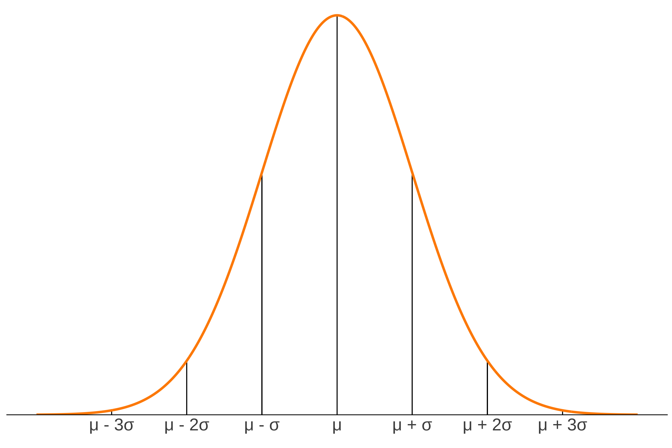
1. 68-95-99.7 rule
Code
<- c ("" , "\U03BC - 3\U03C3" , "\U03BC - 2\U03C3" , "\U03BC - \U03C3" , "\U03BC" , "\U03BC + \U03C3" , "\U03BC + 2\U03C3" , "\U03BC + 3\U03C3" , "" ggplot (data.frame (x = - 4 : 4 ), aes (x)) + geom_linerange (x = 1 , ymin = 0 , ymax = 0.24 ) + geom_linerange (x = - 1 , ymin = 0 , ymax = 0.24 ) + geom_linerange (x = 2 , ymin = 0 , ymax = 0.055 ) + geom_linerange (x = - 2 , ymin = 0 , ymax = 0.055 ) + geom_linerange (x = 3 , ymin = 0 , ymax = 0.005 ) + geom_linerange (x = - 3 , ymin = 0 , ymax = 0.005 ) + geom_linerange (x = 0 , ymin = 0 , ymax = 0.399 ) + stat_function (geom = "line" , n = 1000 , fun = dnorm, args = list (mean = 0 , sd = 1 ), linewidth = 1.5 , color = "darkorange" ) + scale_x_continuous (labels = labels, breaks = seq (- 4 , 4 , by = 1 )) + scale_y_continuous (expand = c (0 , 0 ), limits = c (0 , 0.41 )) + labs (x = "" ) + theme_classic () + theme (panel.grid = element_blank (),axis.text = element_text (size = 22 ),axis.line.y = element_blank (),axis.title.y = element_blank (),axis.text.y = element_blank (),axis.ticks = element_blank ())
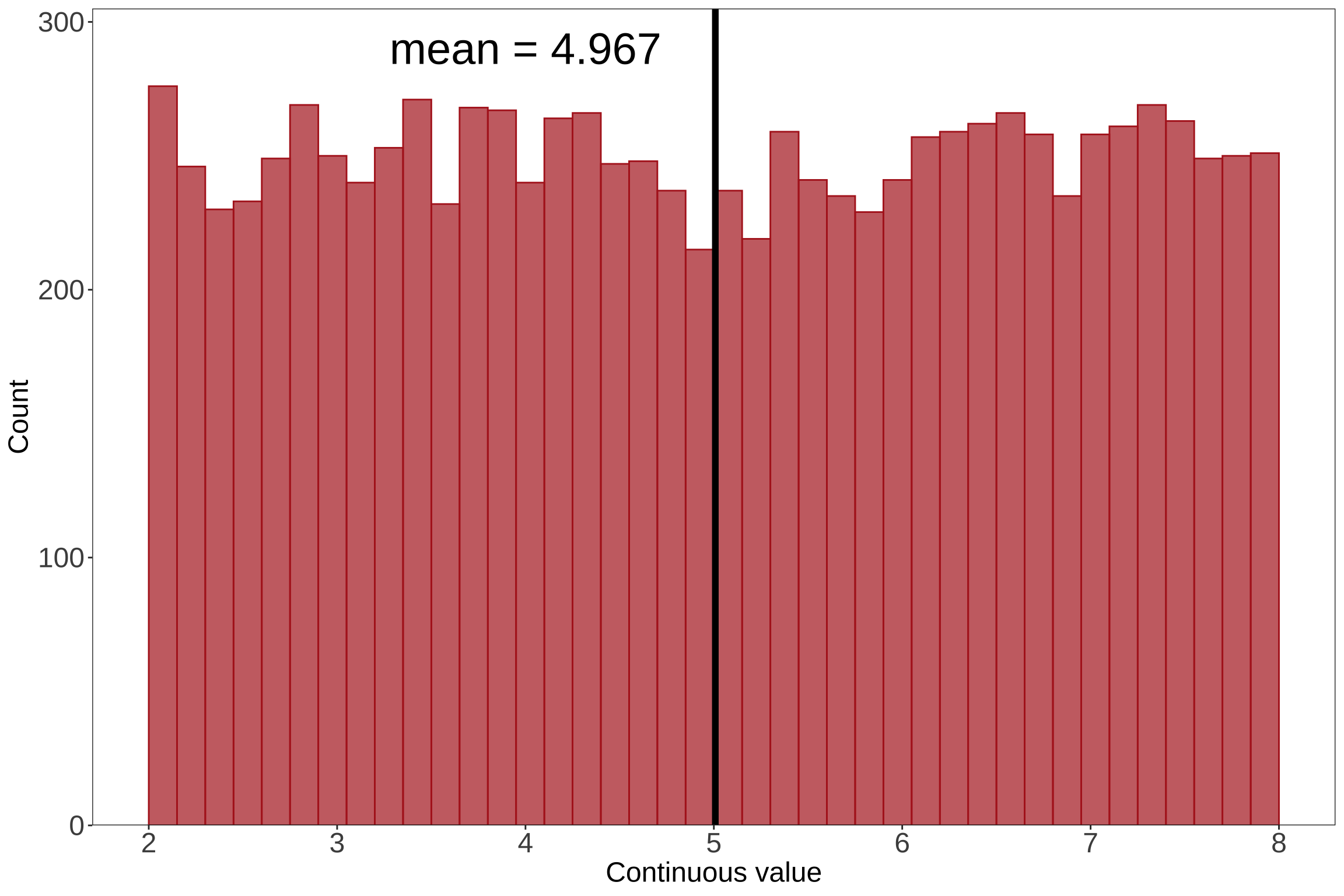
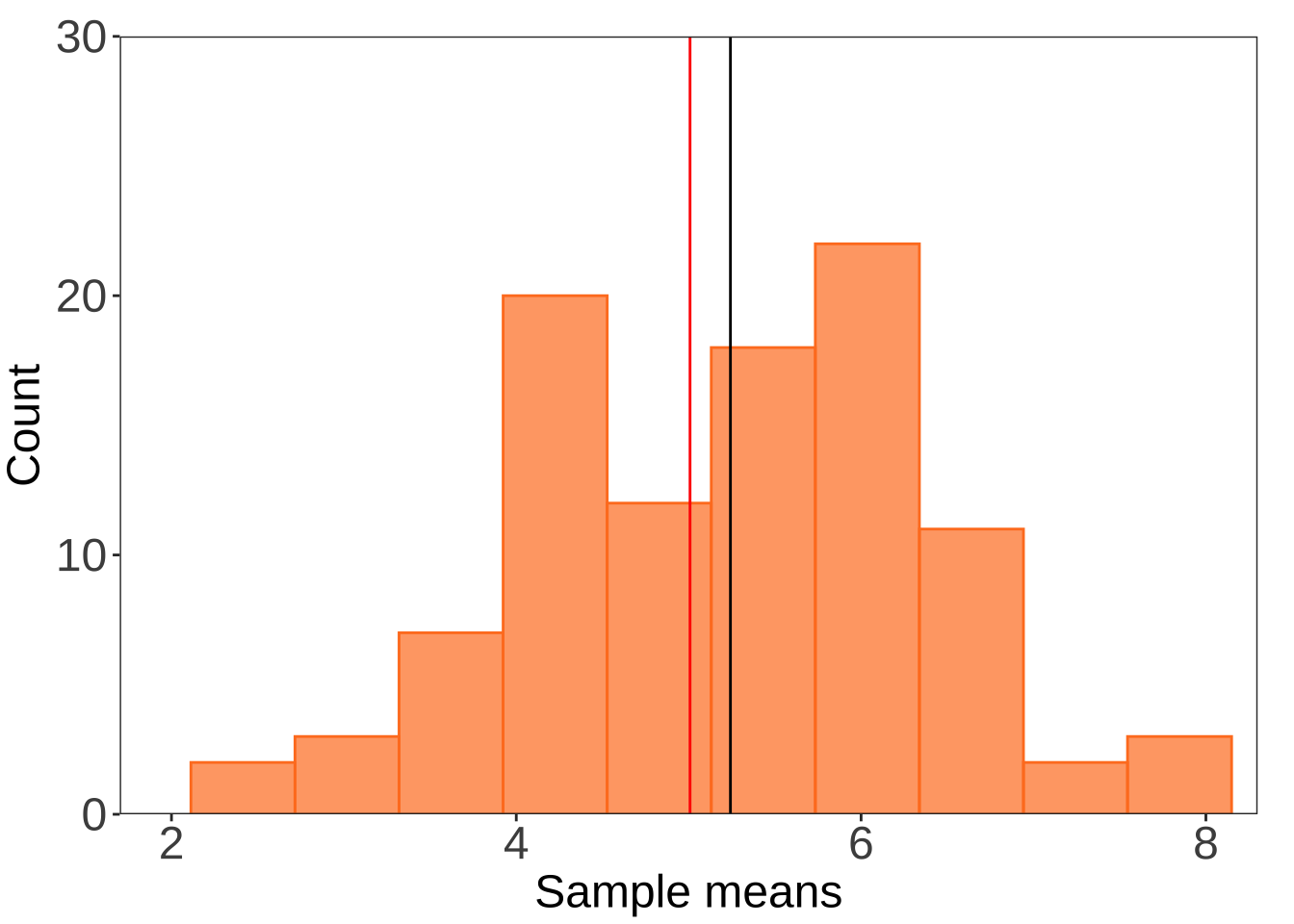
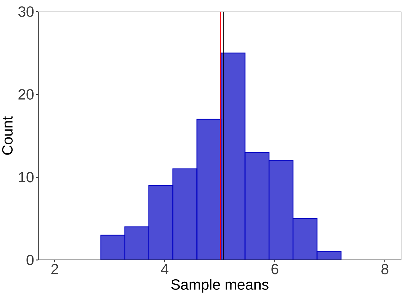
2. central limit theorem
Code
# randomly select 10000 numbers from a uniform distribution for the population <- runif (10000 , min = 2 , max = 8 )# make a histogram for the population <- as.data.frame (uniform)ggplot (uniformdf, aes (x = uniform)) + geom_histogram (breaks = seq (2 , 8 , length.out = 41 ), fill = "firebrick" , alpha = 0.7 , color = "firebrick" ) + geom_vline (xintercept = mean (uniform), linewidth = 2 ) + annotate ("text" , x = 4 , y = 290 , label = "mean = 4.967" , size = 10 ) + scale_x_continuous (breaks = seq (from = 2 , to = 8 , by = 1 )) + scale_y_continuous (expand = c (0 , 0 ), limits = c (0 , 305 )) + labs (x = "Continuous value" , y = "Count" ) + theme_bw () + theme (panel.grid = element_blank (),axis.text = element_text (size = 18 ),axis.title = element_text (size = 18 ))
Code
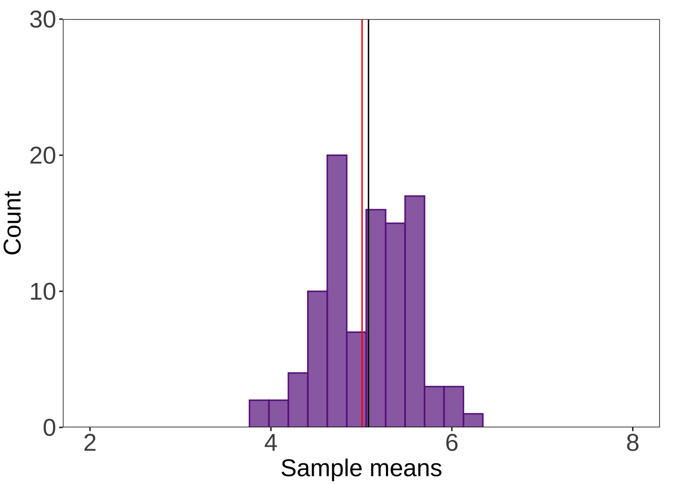
# for() loop to <- c ()<- c ()<- c ()<- c ()<- c ()for (i in 1 : 100 ) {<- mean (sample (uniform, 2 , replace = FALSE ))for (i in 1 : 100 ) {<- mean (sample (uniform, 5 , replace = FALSE ))for (i in 1 : 100 ) {<- mean (sample (uniform, 15 , replace = FALSE ))for (i in 1 : 100 ) {<- mean (sample (uniform, 30 , replace = FALSE ))for (i in 1 : 100 ) {<- mean (sample (uniform, 50 , replace = FALSE ))<- cbind (store2, store5, store15, store30, store50) %>% as.data.frame ()ggplot (df) + geom_histogram (aes (x = store2), bins = 10 , alpha = 0.7 , fill = "chocolate1" , color = "chocolate1" ) + coord_cartesian (xlim = c (2 , 8 ), ylim = c (0 , 30 )) + scale_y_continuous (expand = c (0 , 0 )) + geom_vline (xintercept = mean (store2)) + geom_vline (xintercept = mean (uniform), color = "red" ) + labs (x = "Sample means" , y = "Count" ) + theme_bw () + theme (panel.grid = element_blank (),axis.text = element_text (size = 18 ),axis.title = element_text (size = 18 ),plot.margin = unit (c (0.5 , 0.5 , 0.1 , 0.1 ), "cm" ))
Code
ggplot (df) + geom_histogram (aes (x = store5), bins = 10 , alpha = 0.7 , fill = "blue3" , color = "blue3" ) + coord_cartesian (xlim = c (2 , 8 ), ylim = c (0 , 30 )) + scale_y_continuous (expand = c (0 , 0 )) + geom_vline (xintercept = mean (store5)) + geom_vline (xintercept = mean (uniform), color = "red" ) + labs (x = "Sample means" , y = "Count" ) + theme_bw () + theme (panel.grid = element_blank (),axis.text = element_text (size = 18 ),axis.title = element_text (size = 18 ),plot.margin = unit (c (0.5 , 0.5 , 0.1 , 0.1 ), "cm" ))
Code
ggplot (df) + geom_histogram (aes (x = store15), bins = 12 , alpha = 0.7 , fill = "darkorchid4" , color = "darkorchid4" ) + coord_cartesian (xlim = c (2 , 8 ), ylim = c (0 , 30 )) + scale_y_continuous (expand = c (0 , 0 )) + geom_vline (xintercept = mean (store15)) + geom_vline (xintercept = mean (uniform), color = "red" ) + labs (x = "Sample means" , y = "Count" ) + theme_bw () + theme (panel.grid = element_blank (),axis.text = element_text (size = 18 ),axis.title = element_text (size = 18 ),plot.margin = unit (c (0.5 , 0.5 , 0.1 , 0.1 ), "cm" ))
Code
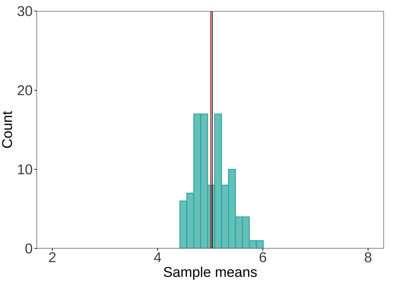
ggplot (df) + geom_histogram (aes (x = store30), bins = 12 , alpha = 0.7 , fill = "lightseagreen" , color = "lightseagreen" ) + coord_cartesian (xlim = c (2 , 8 ), ylim = c (0 , 30 )) + scale_y_continuous (expand = c (0 , 0 )) + geom_vline (xintercept = mean (store30)) + geom_vline (xintercept = mean (uniform), color = "red" ) + labs (x = "Sample means" , y = "Count" ) + theme_bw () + theme (panel.grid = element_blank (),axis.text = element_text (size = 18 ),axis.title = element_text (size = 18 ),plot.margin = unit (c (0.5 , 0.5 , 0.1 , 0.1 ), "cm" ))
Code
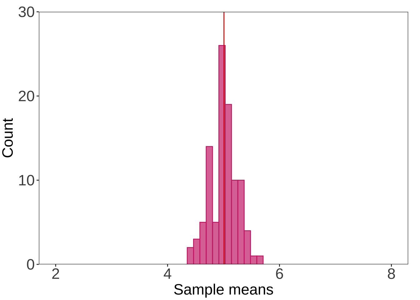
ggplot (df) + geom_histogram (aes (x = store50), bins = 12 , alpha = 0.7 , fill = "violetred3" , color = "violetred3" ) + coord_cartesian (xlim = c (2 , 8 ), ylim = c (0 , 30 )) + scale_y_continuous (expand = c (0 , 0 )) + geom_vline (xintercept = mean (store50)) + geom_vline (xintercept = mean (uniform), color = "red" ) + labs (x = "Sample means" , y = "Count" ) + theme_bw () + theme (panel.grid = element_blank (),axis.text = element_text (size = 18 ),axis.title = element_text (size = 18 ),plot.margin = unit (c (0.5 , 0.5 , 0.1 , 0.1 ), "cm" ))
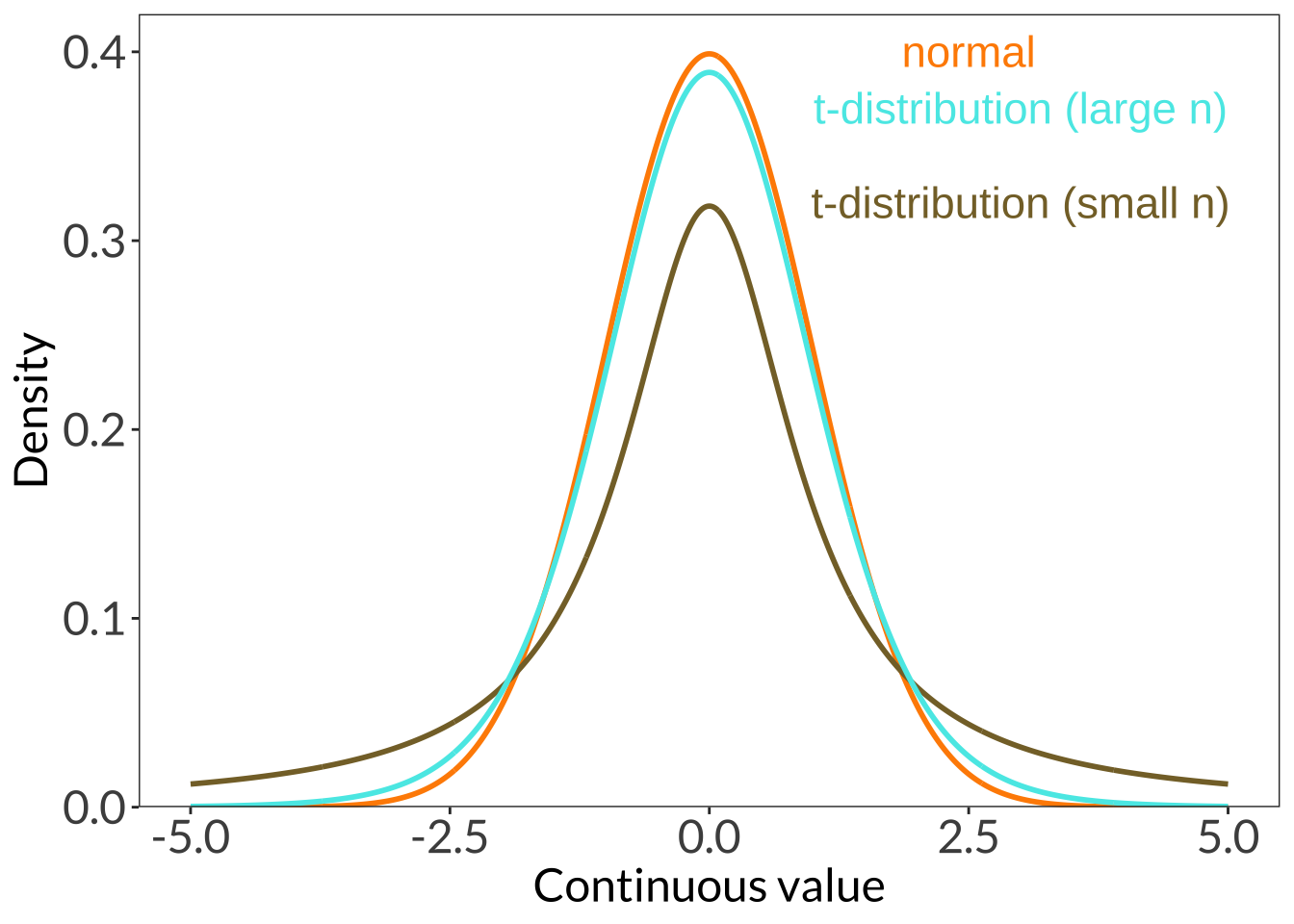
3. z- vs t-distribution
Code
ggplot (data.frame (x = - 5 : 5 ), aes (x)) + stat_function (geom = "line" , n = 1000 , fun = dnorm, args = list (mean = 0 , sd = 1 ), linewidth = 1 , color = "darkorange" ) + annotate ("text" , x = 2.5 , y = 0.4 , label = "normal" , color = "darkorange" , size = 6 ) + stat_function (geom = "line" , n = 1000 , fun = dt, args = list (df = 1 ), linewidth = 1 , color = "#856F33" ) + annotate ("text" , x = 3 , y = 0.32 , label = "t-distribution (small n)" , color = "#856F33" , size = 6 ) + stat_function (geom = "line" , n = 1000 , fun = dt, args = list (df = 10 ), linewidth = 1 , color = "#56E9E7" ) + annotate ("text" , x = 3 , y = 0.37 , label = "t-distribution (large n)" , color = "#56E9E7" , size = 6 ) + scale_y_continuous (expand = c (0 , 0 ), limits = c (0 , 0.42 )) + labs (x = "Continuous value" , y = "Density" ) + theme_bw () + theme (panel.grid = element_blank (),axis.text = element_text (size = 18 ),axis.title = element_text (size = 18 ),text = element_text (family = "Lato" ))
3. math notation
\[
SE_{\bar{x}} = \frac{s}{\sqrt{n}}
\]
4. qqplot examples
Code
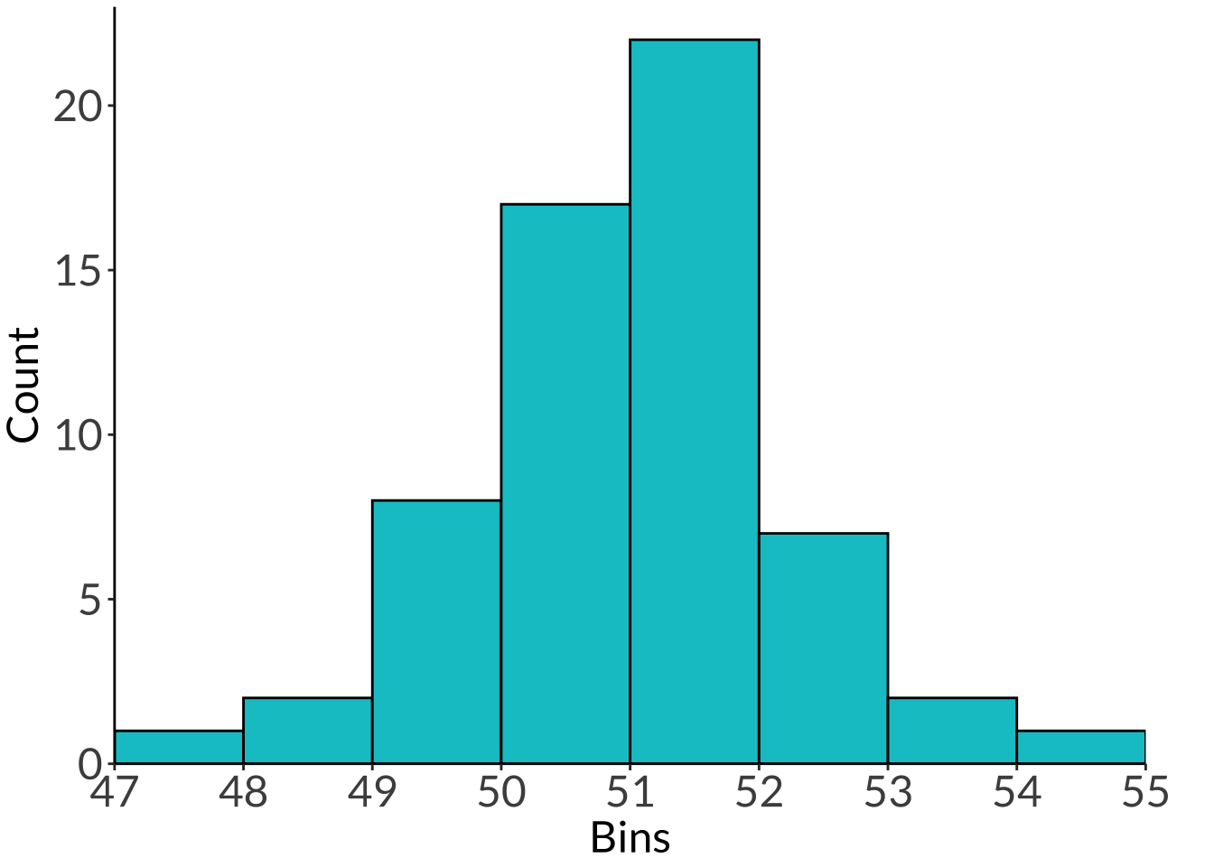
as_tibble (nhtemp) %>% ggplot (aes (x = x)) + geom_histogram (breaks = seq (47 , 55 , length.out = 9 ), fill = "turquoise3" , color = "#000000" ) + scale_x_continuous (breaks = seq (47 , 55 , length.out = 9 ), expand = c (0 , 0 )) + scale_y_continuous (expand = c (0 , 0 ), limits = c (0 , 23 )) + theme_classic () + labs (x = "Bins" , y = "Count" ) + theme (panel.grid = element_blank (),axis.text = element_text (size = 18 ),axis.title = element_text (size = 18 ),text = element_text (family = "Lato" ),plot.margin = unit (c (0.1 , 1 , 0.1 , 0.1 ), "cm" ))
Code
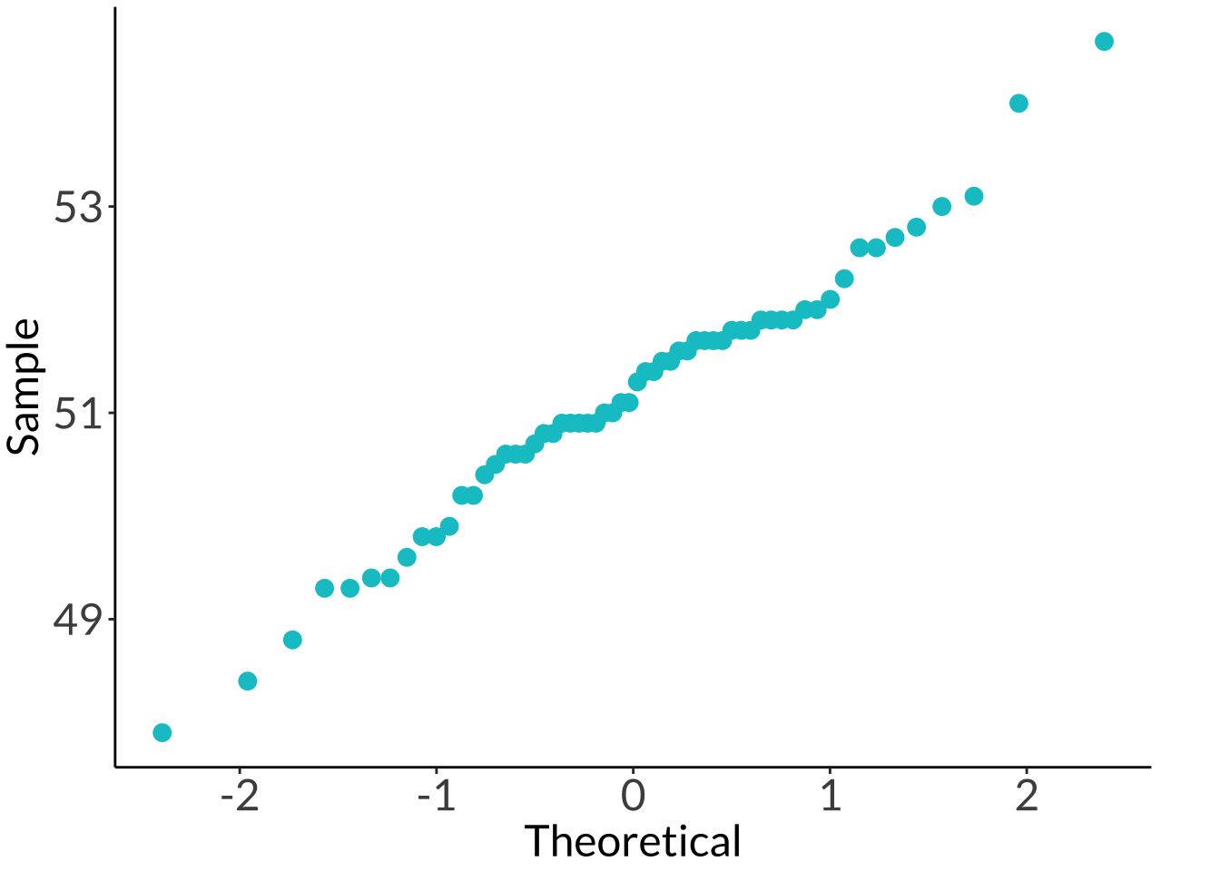
ggplot (as_tibble (nhtemp)) + stat_qq (aes (sample = x), color = "turquoise3" , size = 3 ) + theme_classic () + labs (x = "Theoretical" , y = "Sample" ) + theme (panel.grid = element_blank (),axis.text = element_text (size = 18 ),axis.title = element_text (size = 18 ),text = element_text (family = "Lato" ),plot.margin = unit (c (0.1 , 1 , 0.1 , 0.1 ), "cm" ))
Don't know how to automatically pick scale for object of type <ts>. Defaulting
to continuous.
Code
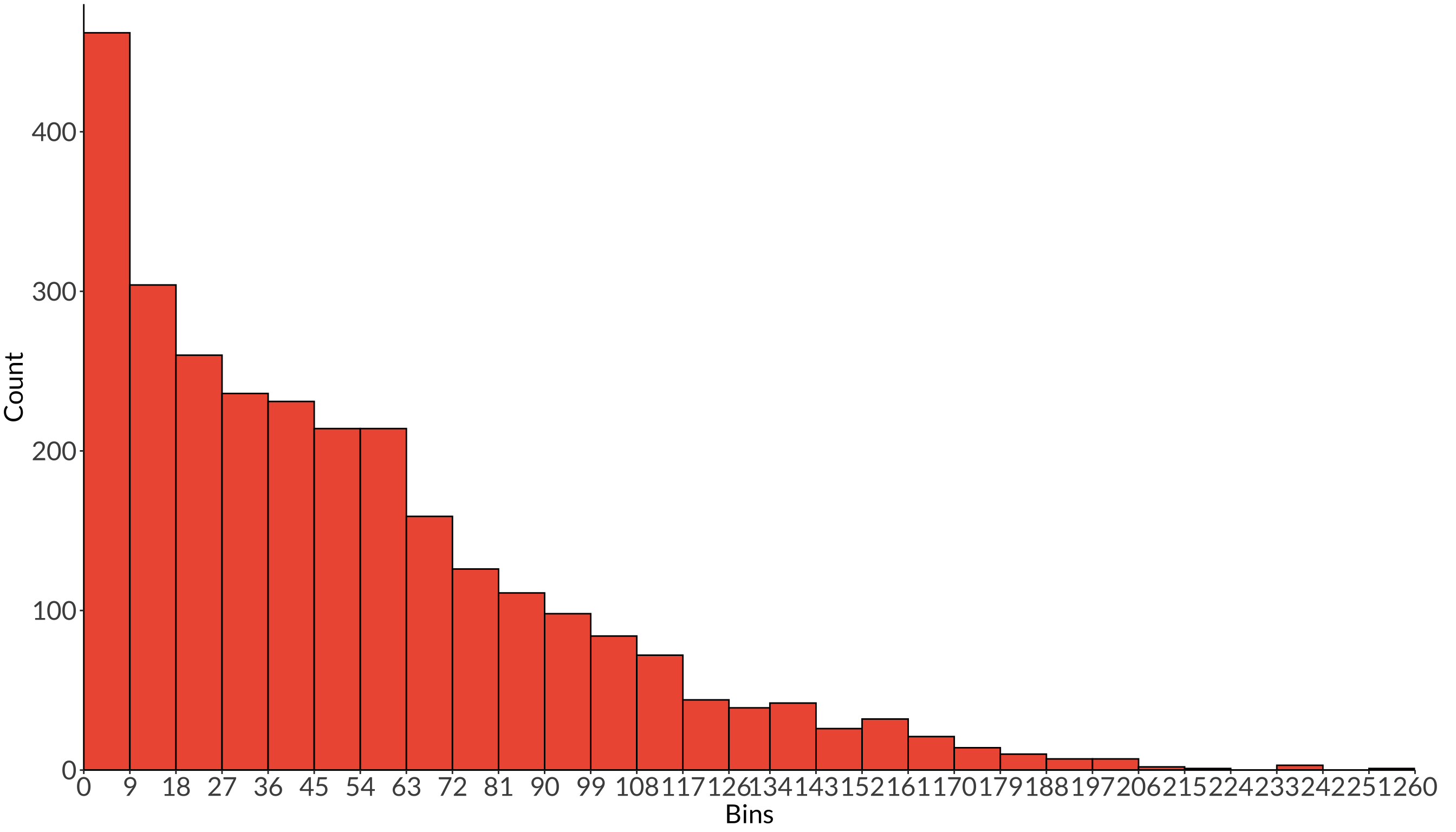
as_tibble (sunspots) %>% ggplot (aes (x = x)) + geom_histogram (breaks = round (seq (0 , 260 , length.out = 30 )), fill = "tomato2" , color = "#000000" ) + scale_x_continuous (breaks = round (seq (0 , 260 , length.out = 30 )), expand = c (0 , 0 )) + scale_y_continuous (expand = c (0 , 0 ), limits = c (0 , 480 )) + theme_classic () + labs (x = "Bins" , y = "Count" ) + theme (panel.grid = element_blank (),axis.text = element_text (size = 18 ),axis.title = element_text (size = 18 ),text = element_text (family = "Lato" ),plot.margin = unit (c (0.1 , 1 , 0.1 , 0.1 ), "cm" ))
Code
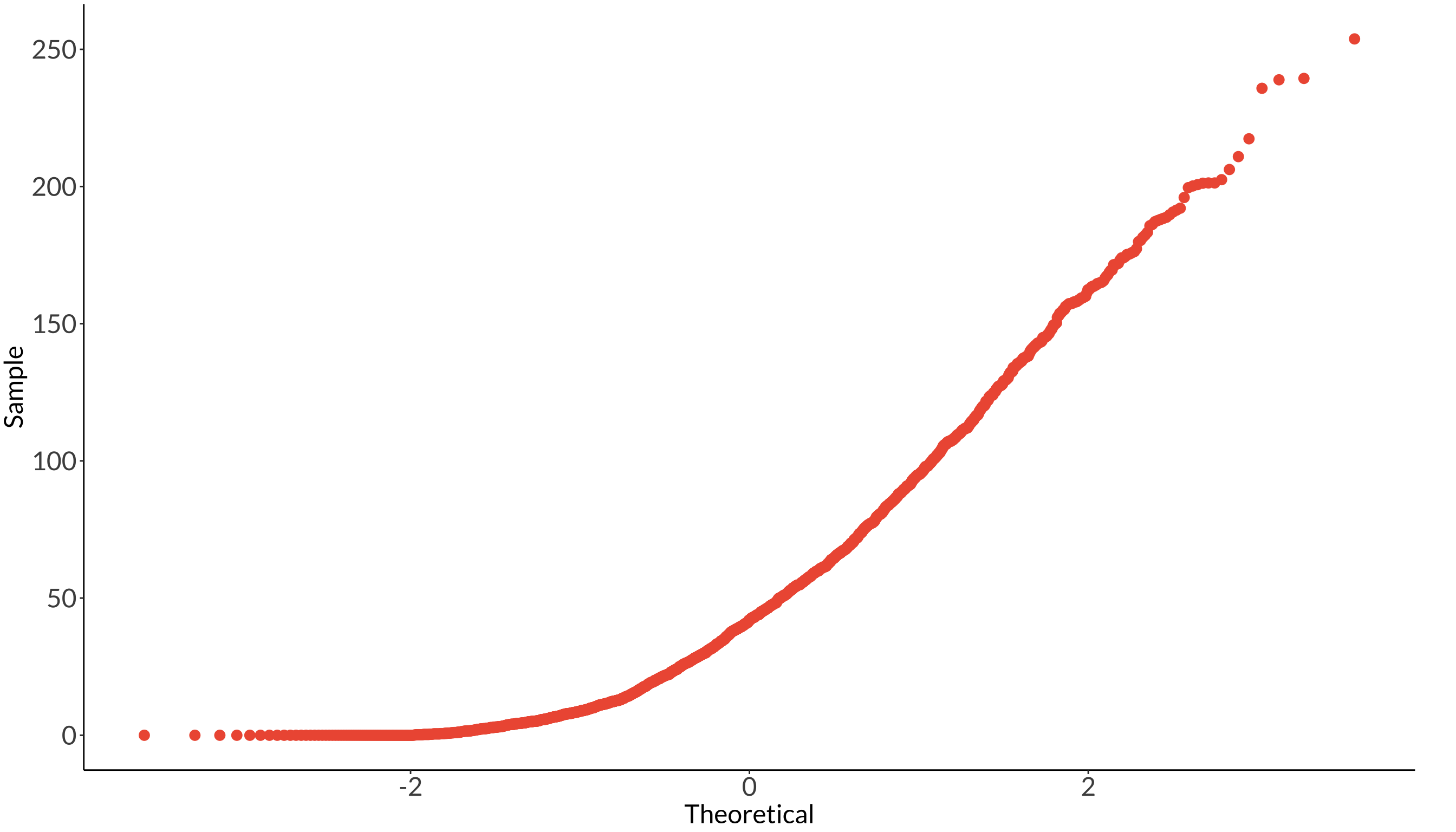
ggplot (as_tibble (sunspots)) + stat_qq (aes (sample = x), color = "tomato2" , size = 3 ) + theme_classic () + labs (x = "Theoretical" , y = "Sample" ) + theme (panel.grid = element_blank (),axis.text = element_text (size = 18 ),axis.title = element_text (size = 18 ),text = element_text (family = "Lato" ),plot.margin = unit (c (0.1 , 1 , 0.1 , 0.1 ), "cm" ))
Don't know how to automatically pick scale for object of type <ts>. Defaulting
to continuous.
Citation BibTeX citation:
@online{bui2023,
  author = {Bui, An},
  title = {Lecture 03 Figures},
  date = {2023-04-17},
  url = {https://an-bui.github.io/ES-193DS-W23/lecture/lecture-03_2023-04-17.html},
  langid = {en}
}
For attribution, please cite this work as: